물음표와 빈 포스터로 시작하는 플랫 설명
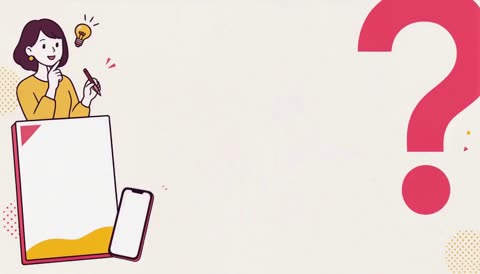
Flat explainer opens on question mark and blank poster
MiniMax H3Image-to-videomontagetransitionhardcutreveal
결과
제작 · ponzponz15 · 영상과 장면의 저작권은 제작자에게 있으며, 원작 주소에서 불러옵니다. 원작 보기
물음표와 빈 포스터 장면으로 시작하는 평면적인 그래픽 설명 영상
프롬프트 원문
For the target video, at 0.00 seconds into the target video, <Picture 1> (from [Shot 1]) is fully referenced. integrated_multimodal_description: Create a complete 10.000-second Japanese flat-illustration explainer commercial for a fictional service that creates simple promotional announcement videos for seminars and events. The service helps customers turn a few images and short pieces of information into a clear, attractive announcement video. Preserve the exact warm-white background, vivid rose-pink question mark, deep-plum outlines, white fills, saturated sunflower yellow, coral-red accent, blank event-poster card, blank smartphone, calendar icon, ticket shape, and clean flat-vector composition from <Picture 1>. Use the visual grammar of the supplied Japanese flat-illustration explainer reference: friendly 2D vector-style characters, thick dark outlines, simple facial features, white clothing areas, flat solid colors, recurring characters, circular information bubbles, document and calendar cards, simple icons, color-field wipes, and restrained cutout animation. Use a compact feminine promotional palette of warm white, deep plum, vivid rose pink, saturated sunflower yellow, and a small coral-red accent. Do not use bright teal, cold blue, neon gradients, metallic colors, or full-screen coffee-brown colors. Use no camera movement. Animate with simple 2D slides, pop-up characters, card assembly, circular bubbles, rounded color wipes, checklist marks, and small scale pops. Typography is a primary information-design element, not subtitles. Use a bold modern Japanese Gothic display style with soft corners, stable stroke width, and high readability. The tone should feel professional, friendly, optimistic, and suitable for women organizing seminars, workshops, lessons, and small events. Do not use handwritten script, luxury serif fonts, futuristic fonts, condensed industrial fonts, or monospaced computer fonts. [Shot 1] Begin exactly from <Picture 1>. Start on the clean warm-white background with the vivid rose-pink question mark partially cropped at the upper-right edge. A blank event-poster card, a blank smartphone, and a small calendar icon slide gently into the lower part of the frame as separate flat cutout layers. The main Japanese headline appears word by word with soft horizontal slide-in motion: "告知動画、" "つくりませんか?" Use vivid rose pink for the key phrase and a simple sunflower-yellow underline. Keep the composition spacious and immediately readable. [Shot 2] At 00:01.600, a vivid rose-pink color field wipes across the frame. A friendly Japanese woman who is organizing a seminar sits at a small desk surrounded by a calendar, smartphone, blank poster cards, loose papers, and a small event ticket. Three white circular speech bubbles pop in one at a time around her, reading: "情報が多い" "準備が大変" "届きにくい" The woman makes a small worried hand gesture while looking at the unfinished poster. Keep her face simple, friendly, and clearly readable. [Shot 3] At 00:03.300, the rose-pink field wipes into a coral-red field. Several blank poster and information cards slide horizontally into a neat row. One card receives a small sunflower-yellow warning mark and wobbles briefly. Large warm-white Japanese text assembles in two stages: "伝えたいことが" "届かない" A short sunflower-yellow underline appears beneath the final phrase. Keep the text large and avoid dense paragraphs or tiny details. [Shot 4] At 00:05.100, the coral-red field wipes into a saturated sunflower-yellow solution field. A friendly Japanese female guide wearing a white shirt and holding a pink folder and a simple magnifying glass pops up from the lower-right. Large outlined Japanese text appears around her: "告知動画" Three white outlined information cards assemble one by one with simple icons and exact labels: "日時" "内容" "申込み" Small rose-pink plus signs appear between the cards. A simple presentation-screen icon and event-ticket icon pop in beside the guide. The cards settle into a clean horizontal information structure. Do not add additional readable words. [Shot 5] At 00:07.300, transition to a vivid rose-pink field. A simple left-to-right workflow assembles from three large flat cards. The cards are labeled: "画像" "文章" "動画" A yellow arrow connects the cards. The first card contains a simple blank image frame, the second contains three abstract black writing lines, and the third contains a finished event-poster composition with large geometric shapes. The headline appears in two stages: "画像と文章から" "かんたん告知" The phrase "かんたん告知" is highlighted in sunflower yellow with a thick underline. Two small circular illustrations pop in around the workflow: one woman speaking at a seminar and one small audience watching attentively. [Shot 6] At 00:08.700, cut to a calm warm-white end card with generous negative space. Place the female guide, event poster, smartphone, and small calendar as a compact illustration group on the left side. Reveal the final Japanese message in large vivid-rose typography: "告知動画、つくりませんか?" Then reveal the second line inside a sunflower-yellow rectangular block: "セミナー・イベントに最適" Keep both final phrases sharp, centered, and readable. Hold the complete end card completely still until exactly 10.000 seconds. overall_soundscape: Generate clean, friendly, beat-synchronized flat-illustration sound design with no voice. Use soft paper-like pops for the poster cards, light UI clicks when the speech bubbles align, a gentle worried wobble sound for the warning card, rounded whooshes for the color-field wipes, crisp clicks as the three feature cards assemble, a bright confirmation chime when the workflow connects, and a clear final impact on "セミナー・イベントに最適". Keep the sound effects short, clean, and slightly playful without becoming childish. No dialogue, no narration, no spoken words, no crowd recording, and no realistic room ambience. non_diegetic_music: Generate an original 10-second upbeat Japanese promotional jingle using bright marimba, warm plucked synth, light hand percussion, soft electronic claps, a rounded bass pulse, and a confident final chord. Begin sparsely during the opening question, become more energetic during the rose-pink problem section, build through the yellow solution section, and reach its strongest point during the workflow and final end card. Synchronize the main musical accents to these moments: 00:00.000 — opening downbeat 00:01.600 — rose-pink problem transition 00:02.200 — speech-bubble accents 00:03.300 — coral-red warning transition 00:04.000 — warning-card impact 00:05.100 — yellow solution transition 00:05.700 — first feature card 00:06.000 — second feature card 00:06.300 — third feature card 00:07.300 — workflow transition 00:07.900 — "画像" accent 00:08.100 — "文章" accent 00:08.300 — "動画" accent 00:08.700 — final-card transition 00:09.300 — strong accent on "セミナー・イベントに最適" 00:10.000 — clean final chord and stop
모음 출처 · github.com